Con-way Freight Mobile Application
i
i
The Problem
An outdated device and user experience could not provide an optimal workflow. Dock freight workflow was not efficient and needed improvement. In addition, users needed a quicker interface where accessing any screen could be accomplished quickly. Integration of a touch keypad should be well thought out given varying environments and clothing the users would be wearing.
i

i
The Goal
Replace an outdated device and the UI that came with it. There was a large need to improve the UX and make the user’s ability to navigate more efficient. Dock work was also seeing issues in freight, so the interface needed to track with far better accuracy. The project took 12 months and was an amazing experience. For the initial 2 months efforts were dedicated to researching the current state of the tool and how it could be improved. The current-state usability was clunky and not streamlined. The new design concept aimed to allow quick navigation an easy decision making on any screen.
Several months were spent interviewing dock-workers to find out the current pain-points of the current device and flow. The team and I discovered that users had a set of often visited screens that we made into the navigation. From those screens users could navigate seamlessly to sub-features within those pages utilizing context menus.
The chosen device was a ruggedized Android OS-based Motorola device (TC-75) with a built in scanner. With a much higher resolution screen than its predecessor I could implement a cleaner UI using Android’s UI guidelines as a foundation (later these guidelines would evolve into the Google Material Design guidelines we know today).
i
i
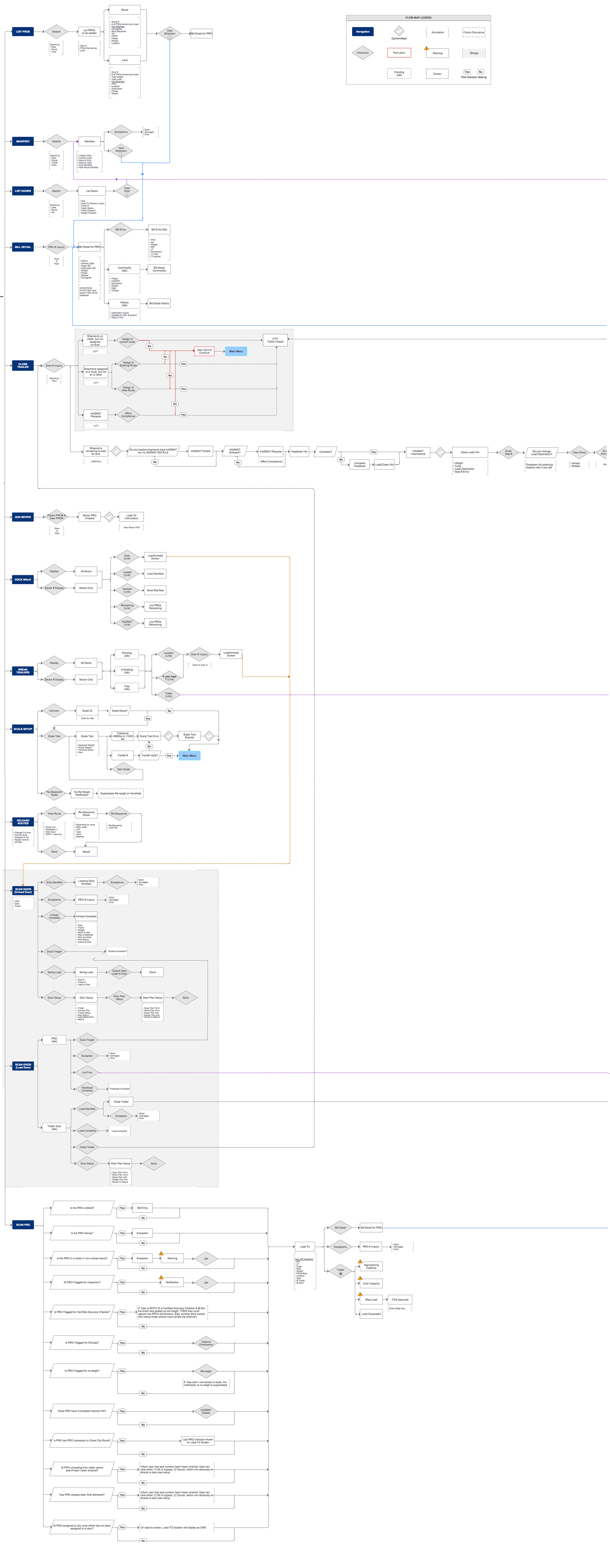
The Current-State Mapping
Below is only part of the entire mapping of the original system, the entire mapping was huge. A detailed complete documented view of the system was needed to derive where issues were. This original mapping, also called the “current state” map, showed where functionality could be simplified and improved to make a better experience for the employee.
i
i
i
Brainstorming
Utilizing a whiteboard is by far my favorite part of the design process. White-boarding during brainstorming sessions was a great way to get thoughts presented quickly in a visual way. Some of the sketches ended up being almost exactly how parts of the end product were designed.

i
i
Wireframe Designing
During the wireframes there was constant improvement. As a team we were constantly examining the current-state mapping and future-state mapping to see where improvement could be made. As a team we utilized feedback from the field to design the interface in such a way that could organize a very data intensive UI and pertinent information. Through different themes the interface could be utilized both inside a dark trailer, or in a lighted area on the dock.

i
i
Interviewing and Testing
During the design of the wireframes there were ongoing interviews and iterative tests. Each iteration presented an opportunity to put small task-based prototypes in front of the user. Feedback and observed user interaction from the prototypes gave good insights to flow and design improvements.
VIEW LOW FIDELITY PROTOTYPE password: UXforlife123
i
i
i
i
i

i

i

i

x
x
x
![]()
All works are copyrighted ©2011 to Chris Meyers and cannot be redistributed or used without permission. Please respect the work of others.
Cmeydesign is a protected name and URL.